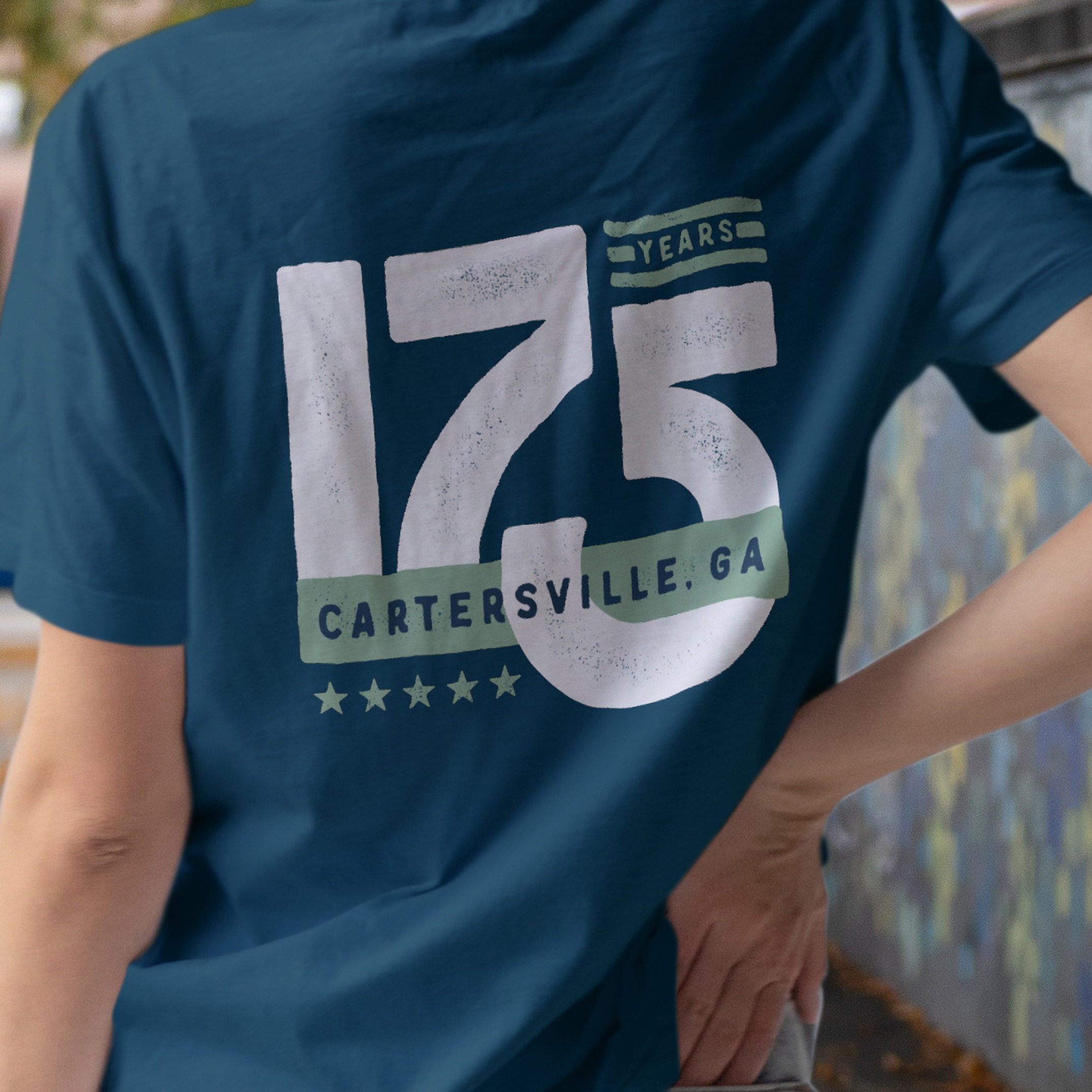
City of Cartersville

The Project: Work with the City PR & Communications Manager, Logan Bagley to rebrand the City of Cartersville, Ga

We knew right away that rebranding a city like Cartersville was a tough challenge. How could one symbol possibly capture everything the city has to offer? It had to work for the city government, reflect the vibrant community, and show off Cartersville as a must-visit destination.

The goal: A brand symbol that’s flexible, versatile, and always fresh, capturing everything Cartersville is and all it has to offer.

The solution: We paired the letter “C” with an abstract window shape to represent how every view through a window offers a unique perspective on what makes this place feel like home. The window element is customizable, allowing us to showcase different images of the city, its events, and its people, making it a versatile symbol that captures all the diverse aspects of Cartersville.

Cartersville City new flag - Doug Chatham Design

A big shoutout to my amazing design partner, Doug Chatham. Together, we set out to build a branding system that’s more than just a logo.

Our vision was to create a versatile, creative framework that could adapt and grow with fresh and dynamic marketing campaigns. This system is crafted to reflect not only the inner workings of our city government but also the vibrant spirit of our community — from local businesses and events to recreational activities and city services.”

– Logan Bagley, PR & Communications Manager